4. Visualizing Quantitative Data
Qingzhou Zhang
2025-12-03
Source:vignettes/vignette_04-quantitative-visualization.Rmd
vignette_04-quantitative-visualization.RmdIntegrating Experimental Data into the Network
While the default ComplexMap visualizations color
complexes by their primary functional domain, a powerful advanced
use-case is to map quantitative experimental data directly onto the
network nodes. This allows you to visualize other biological
information—such as complex abundance, purity scores, or differential
expression—in the context of the functional map.
All three core visualization functions
(visualizeMapDirectLabels,
visualizeMapWithLegend, and
visualizeMapInteractive) support this feature through a
consistent interface. This vignette provides a step-by-step workflow for
creating continuous color visualizations from your own
complex-level quantitative data.
This workflow requires the following packages:
Step 1: Generate a Stable Base Map
The first step is to generate a complete ComplexMap
object. This provides the stable network topology and layout that will
serve as the canvas for our quantitative data.
# Load the package's demo complexes and example GMT file
data(demoComplexes)
gmtPath <- getExampleGmt()
gmt <- getGmtFromFile(gmtPath, verbose = FALSE)

# Run the full workflow to get a ComplexMap object
cm_obj <- createComplexMap(
  complexList = demoComplexes,
  gmt = gmt,
  mergeThreshold = 0.8,
  verbose = FALSE
)

# Extract the node and edge tables
node_table <- getNodeTable(cm_obj)
edge_table <- getEdgeTable(cm_obj)

cat("Generated a base map with", nrow(node_table), "nodes.\n")
#> Generated a base map with 510 nodes.
Step 2: Prepare Your Quantitative Data
This workflow assumes you have a data frame with
complex-level quantitative data. The data frame must
contain a column with the complex IDs that match the
complexId in the ComplexMap node table (e.g.,
“CpxMap_0001”), and at least one other numeric column with the values
you wish to visualize.
Let’s create some sample data representing a “purity score” for a subset of our complexes.
if (nrow(node_table) > 0) {
  # Create sample complex-level data
  set.seed(123) # for reproducibility

  # Sample 50 complexes (or fewer if total < 50)
  n_sample <- min(50, nrow(node_table))

  complex_quant_data <- tibble(
    complexId = sample(node_table$complexId, size = n_sample),
    purity_score = runif(n_sample, min = 0.5, max = 1.0)
  )

  head(complex_quant_data)
}
#> # A tibble: 6 × 2
#>   complexId   purity_score
#>   <chr>              <dbl>
#> 1 CpxMap_0290        0.561
#> 2 CpxMap_0029        0.780
#> 3 CpxMap_0440        0.603
#> 4 CpxMap_0177        0.564
#> 5 CpxMap_0451        0.877
#> 6 CpxMap_0336        0.948
Step 3: Join Quantitative Data to the Node Table
Next, we join our new complex-level quantitative data back to the
main node table. We use a left_join to ensure all original
nodes are kept, even those without quantitative data.
if (exists("complex_quant_data")) {
  # Join the quantitative data to the main node table
  nodes_with_quant <- node_table %>%
    left_join(complex_quant_data, by = "complexId")

  # Preview the new column. Note that complexes without data have NA.
  head(select(nodes_with_quant, complexId, primaryFunctionalDomain, purity_score))
} else {
  nodes_with_quant <- node_table
}
#> # A tibble: 6 × 3
#>   complexId   primaryFunctionalDomain     purity_score
#>   <chr>       <chr>                              <dbl>
#> 1 CpxMap_0414 BIOCARTA_CIRCADIAN_PATHWAY            NA
#> 2 CpxMap_0401 BIOCARTA_RNA_PATHWAY                  NA
#> 3 CpxMap_0359 BIOCARTA_AGPCR_PATHWAY                NA
#> 4 CpxMap_0501 BIOCARTA_SUMO_PATHWAY                 NA
#> 5 CpxMap_0508 Unenriched                            NA
#> 6 CpxMap_0090 BIOCARTA_SALMONELLA_PATHWAY           NA
Step 4: Visualize the Map Using Any Function
Now that our data is prepared, we can use any of the core
visualization functions. The key is to use the color.by
argument to specify which numeric column should be used for the color
gradient.
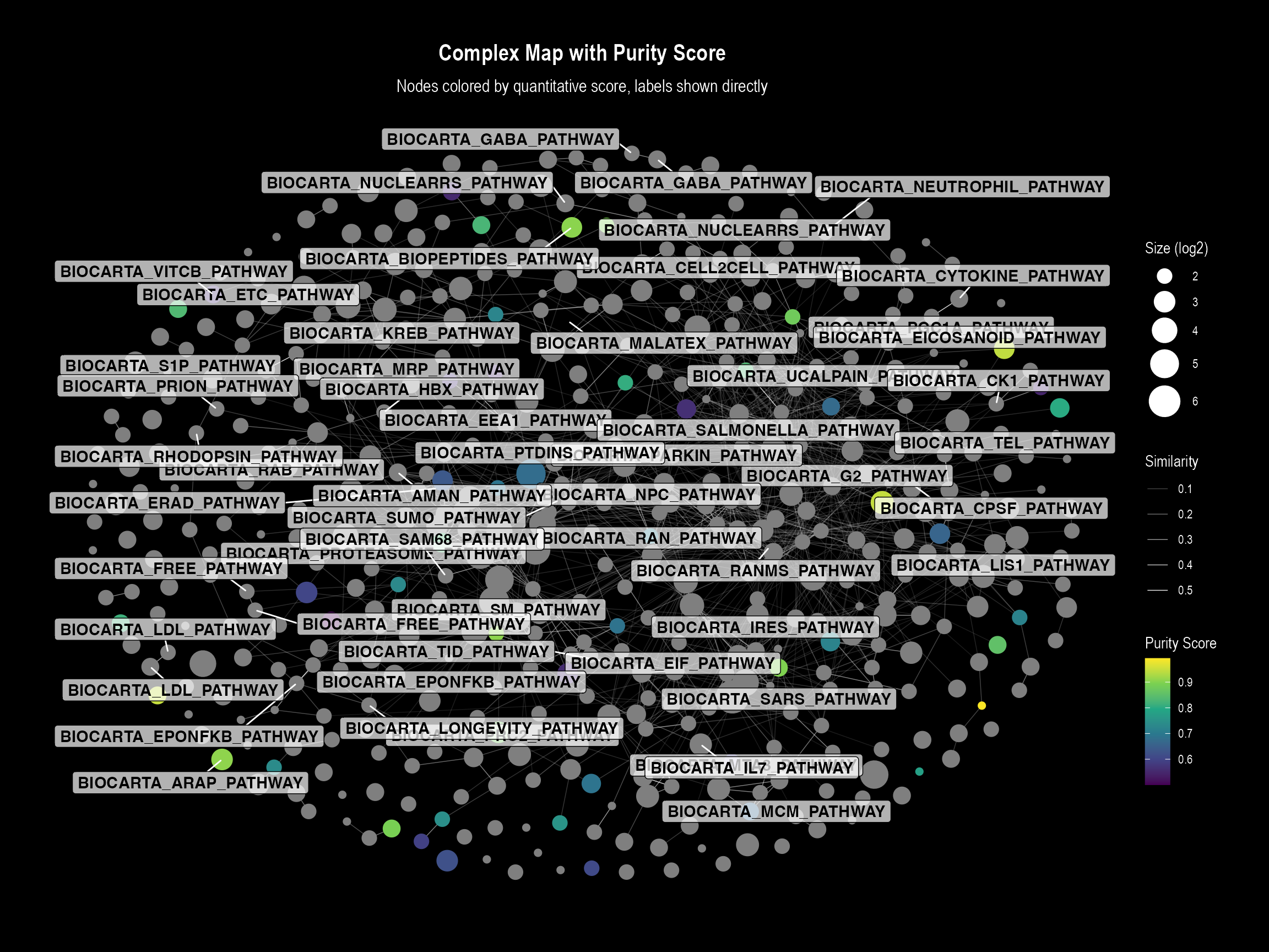
Plot 1: Direct Labels Visualization
This plot is ideal for detailed inspection where labels do not
overlap significantly. The function will automatically generate a
continuous color bar legend for our purity_score.
if (nrow(nodes_with_quant) > 0 && "purity_score" %in% names(nodes_with_quant)) {
  visualizeMapDirectLabels(
    layoutDf = nodes_with_quant,
    edgesDf = edge_table,
    title = "Complex Map with Purity Score",
    subtitle = "Nodes colored by quantitative score, labels shown directly",

    # --- Key arguments for continuous coloring ---
    color.by = "purity_score",
    color.palette = "viridis",
    color.legend.title = "Purity Score"
  )
}
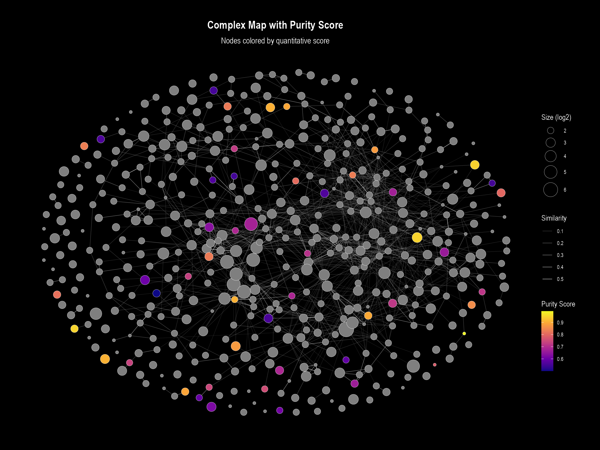
Plot 2: Visualization with Legend
This plot uses the same underlying logic but is designed for
overviews. When color.by is specified, it overrides the
default discrete legend (for functional domains) and instead creates a
continuous color bar.
if (nrow(nodes_with_quant) > 0 && "purity_score" %in% names(nodes_with_quant)) {
  visualizeMapWithLegend(
    layoutDf = nodes_with_quant,
    edgesDf = edge_table,
    title = "Complex Map with Purity Score",
    subtitle = "Nodes colored by quantitative score",

    # --- Key arguments for continuous coloring ---
    color.by = "purity_score",
    color.palette = "plasma", # We can easily switch palettes
    color.legend.title = "Purity Score"
  )
}
Plot 3: Interactive Visualization
The same principle applies to the interactive plot. By specifying
color.by, the function will color the nodes on a gradient
and add the quantitative value to the hover
tooltip.
if (nrow(nodes_with_quant) > 0 && "purity_score" %in% names(nodes_with_quant)) {
  visualizeMapInteractive(
    layoutDf = nodes_with_quant,
    edgesDf = edge_table,
    title = "Interactive Complex Map with Purity Score",

    # --- Key arguments for continuous coloring ---
    color.by = "purity_score",
    color.palette = "viridis"
  )
}