Chapter 5: Visualizing High-Dimensional Biology (PCA and Clustering)
Dimensionality Reduction Compresses Space, Not Signal
An RNA-seq dataset measuring 20,000 genes across 50 samples is a mathematical matrix in 20,000-dimensional vector space. Linear algebra allows us to project this space into two dimensions, but dimensionality reduction finds directions of maximum variation—not biological truth. Never confuse a projection of data with biological reality.
Core Concepts
In high-throughput genomics, data matrices are inherently high-dimensional: \(N\) samples measured across \(P\) features (e.g., \(P = 20,000\) genes).
I suggest you visualize this mathematically: Each sample is not a row in a spreadsheet; it is a single vector positioned in 20,000-dimensional gene coordinate space:
\[\mathbf{x}_i = \begin{bmatrix} x_{i,1} \\ x_{i,2} \\ \vdots \\ x_{i,20000} \end{bmatrix} \in \mathbb{R}^{20000}\]
The human brain cannot visualize geometry beyond three dimensions. We must project this 20,000-dimensional space down to two or three dimensions to inspect sample relationships visually.
Fortunately, genes do not act independently. Biological pathways, cellular sub-types, and transcriptional networks involve the coordinated co-expression of hundreds of genes. Because variables are strongly correlated, the effective dimensionality of the transcriptomic matrix is far lower than 20,000. It is low-rank—meaning the data cloud occupies a lower-dimensional subspace embedded within 20,000-dimensional space.
Preprocessing Prerequisites: Transforming Counts for Linear Projection
Before applying dimensionality reduction, I recommend you connect directly back to the statistical lessons of Chapter 4.
Why can you not run PCA directly on raw sequencing counts?
Library Size Dominance: Raw counts reflect total flow cell sequencing depth. A sample sequenced to 40 million reads will sit far apart from a sample sequenced to 10 million reads along the first principal component, regardless of biology.
Mean-Variance Heteroscedasticity: In raw counts, variance scales quadratically with the mean (\(\text{Var} = \mu + \alpha \mu^2\)). Highly expressed genes (such as ribosomal proteins with 50,000 counts) exhibit massive absolute variance (\(s^2 \approx 10^7\)), completely dominating the linear algebra calculation while subtle regulatory transcription factors (50 counts) are ignored.
To prepare a dataset for PCA or clustering, you must pass raw counts through a rigorous 4-step preprocessing transformation:
\[\text{Raw Counts} \xrightarrow{\text{1. Size Factor Norm.}} \text{Normalized Counts} \xrightarrow{\text{2. VST / log-CPM}} \text{Variance Stabilization} \xrightarrow{\text{3. HVG Selection}} \text{HVG Matrix} \xrightarrow{\text{4. Centering \& Scaling}} \text{PCA Input Matrix}\]
Size Factor Normalization: Divide raw counts by DESeq2/edgeR size factors (\(s_j\)) to equalize sequencing depth.
Variance Stabilization: Apply log-CPM or Variance Stabilizing Transformation (VST) so that variance is approximately homoscedastic across all expression levels.
Highly Variable Gene (HVG) Selection: Filter the matrix to the top 1,000–3,000 most variable genes, stripping uninformative static background noise.
Centering and Scaling: Subtract the mean (\(\mu_g = 0\)) and scale to unit variance (\(\sigma_g = 1\)) across genes so that every gene contributes equally to coordinate rotation.
Principal Component Analysis (PCA): Rotating Orthogonal Axes
Principal Component Analysis is a linear algebra technique (computed via Singular Value Decomposition [SVD] of the centered covariance matrix) that rotates the high-dimensional coordinate system to align new orthogonal axes with the directions of maximum total sample variance.
Principal Component 1 (PC1): The single axis in 20,000-dimensional space along which sample data points exhibit the greatest spread (variance).
Principal Component 2 (PC2): The second axis, constrained to be strictly perpendicular (orthogonal) to PC1, capturing the next largest amount of remaining variance.
Scores, Loadings, and Eigenvalues
PCA Scores (Sample Coordinates): The coordinates of each sample projected onto the new principal components. Plotting PC1 vs. PC2 creates a 2D map of sample relationships.
PCA Loadings (Feature Weights): The entries of the rotation matrix (eigenvectors) that define how much each gene contributes to a principal component. A gene with a large absolute loading on PC1 strongly drives sample separation along that axis.
- Mathematical Nuance: The sign of PCA loadings (\(\pm\)) is arbitrary; multiplying an eigenvector by \(-1\) produces an identical PC coordinate projection. Always interpret loading directions relative to sample score positions.
Variance Explained & Scree Plots: The proportion of total variance captured by each component. A scree plot displays variance explained per PC in descending order.
- Scree Plot Nuance: Do not assume an “elbow” cleanly separates “biological signal” from “random noise.” Later PCs (PC3, PC4, PC5) often contain critical secondary biological signals, tissue sub-types, or subtle experimental effects.
Unsupervised Clustering: Partitioning Feature Space
While PCA rotates continuous space to display variance, unsupervised clustering partitions samples or features into discrete groups based on a mathematical definition of distance.
PCA and clustering are complementary: PCA asks where variance lies; clustering asks which samples form distinct neighborhoods.
Hierarchical Clustering: Builds a nested tree (dendrogram) of sample relationships.
Distance Metrics: Calculates pairwise sample distances using Euclidean distance (\(d = \sqrt{\sum (x_i - y_i)^2}\)) for absolute magnitude differences, or Pearson/Spearman correlation distance (\(d = 1 - r\)) to measure profile shape similarity regardless of baseline magnitude.
Linkage Criteria: Agglomerates samples using Ward’s minimum variance or average linkage to build hierarchical trees.
K-Means & Graph-Based Clustering: Partitions samples into \(K\) distinct centroids or constructs nearest-neighbor graphs (SNN graphs in single-cell omics).
[!WARNING] Clustering Algorithms Do Not Know Biology: Clustering algorithms will partition any distance matrix into \(K\) clusters, even if fed completely random noise. Clusters are mathematical partitions, not automatic biological cell types or disease subtypes.
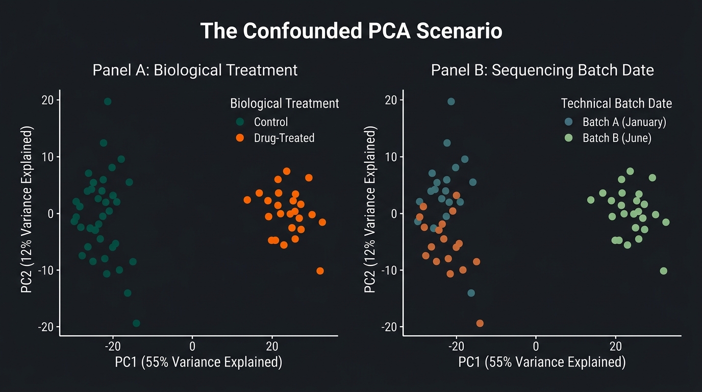
Figure 5.1: The Confounded PCA Scenario. A two-panel schematic illustrating technical batch effect confounding across 50 RNA-seq samples. (Panel A) PCA scatter plot colored by Biological Treatment (Control vs. Drug-Treated), showing apparent sample separation along the primary axis of variance (PC1, 55% variance explained). (Panel B) The identical PCA coordinates re-colored by Technical Sequencing Date (Batch A in January vs. Batch B in June). The overlay demonstrates that PC1 is entirely driven by technical sequencing date rather than biological drug response, while the true treatment effect separates vertically along PC2 (12% variance explained).
Biological Interpretation
The Confounded Experiment: Running Visual Scenario
Consider a dataset of 50 RNA-seq samples evaluating a novel targeted therapy: 25 Control samples and 25 Drug-Treated samples. The samples were prepped and sequenced across two calendar dates (Batch A in January, Batch B in June).
You execute preprocessing, compute PCA, and plot PC1 vs. PC2:
- You color the plot by Biological Treatment (Control vs. Treated). You observe two distinct clusters separated along the X-axis (PC1, 55% variance explained). You celebrate an apparent biological breakthrough.
- You then color the exact same PCA plot by Sequencing Batch Date (Batch A vs. Batch B). To your horror, Batch A samples sit entirely on the left side of PC1, and Batch B samples sit entirely on the right.
What did PCA actually discover?
PCA did not discover a drug treatment response on PC1. It discovered a massive technical batch effect (55% of total variance) caused by differences in kit reagents, temperature, or flow cell optics between January and June. The biological treatment effect was secondary, captured along PC2 (12% variance explained).
Batch Modeling vs. Irreparable Confounding
- Balanced Batch Design: If Batch A contained 12 Controls and 13 Treated samples, and Batch B contained 13 Controls and 12 Treated samples, the batch effect is balanced. Statistical linear models (such as
ComBator DESeq2 design formulas~ batch + treatment) can model and remove the batch variance, isolating the true treatment effect. - Confounded Batch Design: If all 25 Controls were prepped in Batch A (January) and all 25 Treated samples were prepped in Batch B (June), treatment and batch are 100% confounded. No linear algebra, batch correction algorithm, or AI model can separate biological drug response from technical date artifacts. The experiment is scientifically dead.
Three Golden Rules of PCA Interpretation
I recommend you internalize three critical rules whenever auditing a PCA plot:
- Separated clusters do not prove biological difference: A clear separation of sample clusters on PC1/PC2 can be driven by technical batch, cell viability differences, or sample collection site rather than true biology. Always color PCA plots by all recorded technical metadata before drawing biological conclusions.
- Lack of separation on PC1/PC2 does not prove absence of biological effect: If technical noise or biological background variation is large, PC1 and PC2 may capture uninteresting variance (such as sex or age). A genuine treatment effect may align along PC3 or PC4.
- PC1 measures maximum variance, not biological importance: Linear algebra maximizes spread (\(\sum (\hat{x} - \mu)^2\)), not scientific significance. The largest variance in a tissue dataset may reflect muscle vs. fat tissue proportion rather than therapeutic response.
Current Landscape
Dimensionality reduction and clustering infrastructure have expanded for complex single-cell and spatial omics:
- Non-Linear Manifold Learning (t-SNE and UMAP): While PCA uses linear rotation to preserve global Euclidean distance, single-cell omics uses non-linear manifold learning—such as t-Distributed Stochastic Neighbor Embedding (t-SNE) and Uniform Manifold Approximation and Projection (UMAP). These algorithms optimize local k-nearest neighbor distances, compressing complex single-cell trajectory manifolds into 2D plots for cell-type cluster visualization.
- PCA as the Foundation for Manifold Learning: Non-linear methods like UMAP and t-SNE suffer from severe noise if calculated directly on 20,000 genes. Modern single-cell pipelines (Seurat, Scanpy) run PCA first to compress 20,000 genes into the top 30–50 principal components, then run UMAP and graph-based Louvain/Leiden clustering on the PCA space.
- High-Dimensional Batch Integration (Harmony and Seurat CCA): When merging single-cell datasets across laboratories, algorithms like Harmony and Canonical Correlation Analysis (CCA) operate directly within PCA subspace. They iteratively align batch-specific cluster centroids while preserving biological cell-type variance.
Summary and Required Reading
- Genomic data forms high-dimensional vector space: \(N\) samples across 20,000 genes represent vectors in 20,000-dimensional space; gene co-expression makes this space low-rank.
- Never run PCA directly on raw counts: Normalize size factors, apply variance-stabilizing transformations (VST), select highly variable genes, and center/scale features first.
- PCA maximizes variance, not biological truth: PC1 is the axis of maximum sample variance; it captures whatever varies most, whether biology or technical batch.
- Clustering partitions distance metrics: Hierarchical and K-means algorithms group samples based on defined distances (Euclidean, Pearson correlation); clusters are mathematical partitions, not automatic biological identities.
- Color by technical variables first: Always color PCA plots by batch, date, and technician before coloring by treatment. Confounded experimental designs cannot be fixed computationally.
Required Reading
- Wall, M. E., Rechtsteiner, A., & Rocha, L. M. (2003): “Singular value decomposition and principal component analysis.” A Practical Approach to Microarray Data Analysis, 91-109.
- Jolliffe, I. T., & Cadima, J. (2016): “Principal component analysis: a review and recent developments.” Philosophical Transactions of the Royal Society A, 374(2065), 20150202.
Johnson’s Rule: A PCA plot is the mirror of your experimental design. If your biological treatment is completely confounded with your technical batch, no linear algebra or statistical model can rescue your analysis. Audit variance before you claim discovery.